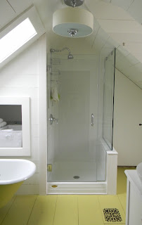
Old house remodels are always challenging. For this project the challenge is the ceiling height and the knee walls. The roof could not be raised and the homeowner did not want to add dormers.
Click on the photos to enlarge them.
 |
| This is the starting point. A very sad and worn bathroom. |
 |
| This is the dormer wall. |
 |
| Clawfoot tub will stay. |
 |
| Very odd location of toilet. I am strongly against the toilet being the view from the doorway. |
|
|
Once I measure the space I begin to design the layout.
 |
| Always start with a floorplan. |
| | | | | | |
Once the layout is decided than the demolition starts.
 |
| The space had to be gutted down to the framing. |
Gutting the space entirely allows for adequate insulation to be installed.
 |
| The space stars to take shape. |
Once the framing and insulation is in place the finished surfaces are installed. In this case we are building wall surfaces from wood. This is to give it a vintage look. All will be painted.
 |
| The clawfoot tub will be going under the skylight and the shower is to the right. |
In the final stages. Floor is down. Floors and walls will be painted then the tile, glass shower enclosure and fixtures will be installed. It took a long time, but this was a major remodel.
 |
| Glass will be on the right side to keep the space visually open. |
 |
| The vanity will be installed on the right wall. |
All done except for the shower tile and glass. Now it is time to add the accessories and decorative touches.
 |
| The toilet area with niche for supplies. Making use of the knee wall space. |
 |
| This is the towel /bin niche to the right of the tub. |
 |
| The clawfoot tub is back in the original space. To the right is a niche for storage. Before that was just underutilized space. |
 |
| The head height limited the light mounting area. I chose a sconce with two lamps to mount vertically. |
 |
| This is where the toilet was. Now I've maximized the floor space and usable ceiling height. |
 |
| The shower will be finished with white subway tile and clear glass. |
 |
| Tiled shower with glass door surround. |
 |
| Shower with two custom cubbies for product. I like to tuck those into the side wall of a shower. |
 |
| The glass shower surround keeps the bathroom visually open. |
 |
| With sloped ceilings, there isn't much room for towel racks. so we went with hooks on the door. |
This bathroom is an excellent example that when a space with knee walls and low roof / ceiling challenges does have the ability to be transformed into an very useful and functional space.
Julie Fergus, ASID is a professional interior / home designer. Her showroom and design studio is American Home Gallery located at 49 Center Street in Wolfeboro, NH. Julie’s design projects have been published in Country Home, Better Homes and Gardens, Yankee and New Hampshire Magazine. To contact Julie visit her website.


